 collective
Browse / github.com/storytold/craft-libs / patch
craft-ui: Slider and ZoomBar for the Office-style apps
craft-ui: Slider and ZoomBar for the Office-style apps ## Summary Two components for WordCraft, GridCraft and DeckCraft. All three build their sliders on egui's built-in one, and their themes make its rail almost or entirely invisible: - **`craft_ui::slider::Slider`**, with an optional editable value field; - **`craft_ui::slider::ZoomBar`**: `−`, a logarithmic slider, `+` and the percentage, the Office status-bar zoom control. 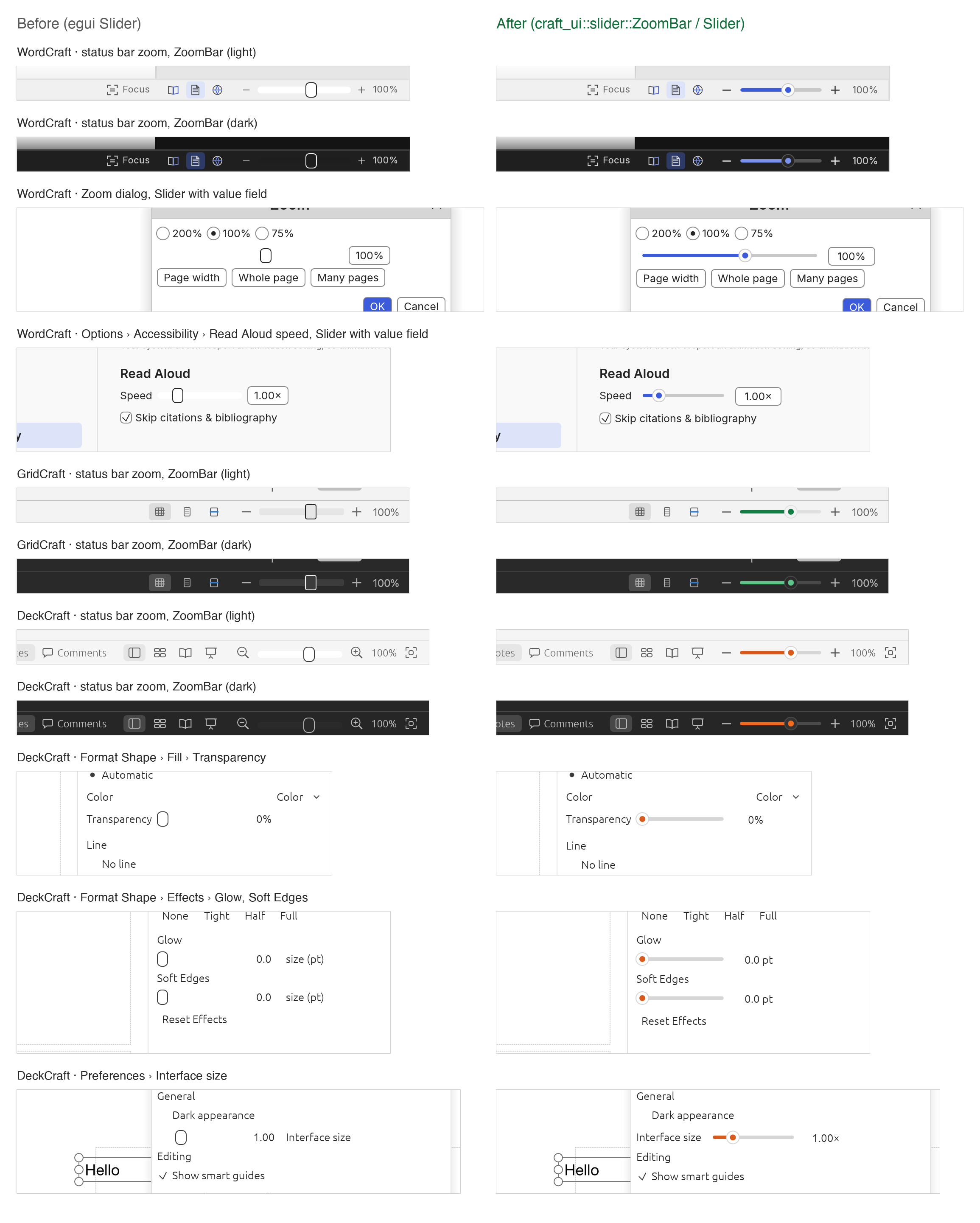 Left: today (egui `Slider`). Right: the same plac
- Status
- open
- Score
- 0.00
- Adopters
- 0 other operators
- Author
- brzuchal (imported from pull request #33, open)
- Base
a0916808f7d78bed8c7b90cdf937176015454a7f- Size
- +892 −0 in 4 files
- Review
- pending
- Shared
- 2026-10-28
- Id
616b1d4dc1e2ce43df8c2a26
How it went
No other operator has reported using it yet.
Diff
raw · crates/ui/src/lib.rs crates/ui/src/slider/mod.rs crates/ui/src/slider/tests.rs crates/ui/src/slider/zoom.rs
@@ -13,6 +13,7 @@ pub mod icons; pub mod layout; pub mod panes; pub mod printing;+pub mod slider; pub mod tabs; pub mod text; pub mod theme;new file mode 100644@@ -0,0 +1,374 @@+//! A slider with a visible, filled track and an optional editable value field.+//!+//! egui's built-in slider draws a thin rail in `widgets.inactive.bg_fill`, which several Craft+//! themes make nearly invisible, so only a lone handle shows and users don't recognise it as a+//! slider. This one paints a track that is always visible, fills it with the accent up to the+//! thumb, marks the default value with a tick (double-click the track to return to it), and keeps+//! an optional value field at a fixed width so nothing next to it moves when the number gains a+//! digit. Applications supply the colors through [`SliderStyle`]; nothing global is changed.+//!+//! Interaction: drag or click the track; the thumb follows the pointer smoothly even when the+//! value snaps to a [`Slider::step`]. With keyboard focus, Left/Down and Right/Up move one step+//! (or 1% of the track), Page Up/Down ten, Home/End to the ends. Assistive technology sees a slider+//! with the given label and value, and its increment/decrement actions work.+//!+//! [`ZoomBar`] combines a logarithmic slider with `−`/`+` buttons and a fixed-width percentage, the+//! status bar zoom control of the Office-style apps.++use std::ops::RangeInclusive;++use egui::{Color32, CornerRadius, EventFilter, Key, Rect, Response, Sense, Stroke, StrokeKind, Ui, Vec2, pos2, vec2};++mod zoom;++pub use zoom::{ZoomBar, ZoomBarLabels, ZoomBarResponse, ZoomBarStyle};++/// A number typed into the value field, with or without its suffix. The suffix itself is taken+/// off first, so one with a digit in it (`24fps`) is not cut short; then whatever is left of a+/// half-typed one. A decimal comma counts as a point. Any other text after the number makes the+/// input invalid (`12xyz` is not 12), so the field keeps its value.+fn parse_typed(text: &str, suffix: &str) -> Option<f64> {+ let t = text.trim();+ let t = if suffix.is_empty() { t } else { t.strip_suffix(suffix).unwrap_or(t) };+ let number = t.trim_end_matches(|c: char| !c.is_ascii_digit());+ let rest = t.get(number.len()..).unwrap_or("").trim();+ let half_typed = !suffix.is_empty() && suffix.starts_with(rest);+ if !(rest.is_empty() || rest == "." || rest == "," || half_typed) {+ return None;+ }+ number.trim().replace(',', ".").parse().ok()+}++#[cfg(test)]+mod tests;++/// Colors for a [`Slider`], built from the application's own tokens.+#[derive(Clone, Copy, Debug, PartialEq)]+pub struct SliderStyle {+ /// The unfilled part of the track.+ pub track: Color32,+ /// The track from its start to the thumb, usually the accent.+ pub fill: Color32,+ /// The thumb's face and border.+ pub thumb: Color32,+ pub thumb_stroke: Stroke,+ /// The dot in the thumb's centre, usually the accent; it grows while hovered or dragged.+ pub dot: Color32,+ /// The tick at the default value ([`Slider::mark`]).+ pub mark: Color32,+ /// An outline around the thumb while the slider has keyboard focus; `Stroke::NONE` opts out.+ pub focus_stroke: Stroke,+}++impl SliderStyle {+ /// A style derived from egui visuals: the accent from `selection.bg_fill`, the track from the+ /// noninteractive border, the thumb from the window fill. Applications with design tokens+ /// should construct the style from those instead.+ pub fn from_visuals(v: &egui::Visuals) -> Self {+ Self {+ track: v.widgets.noninteractive.bg_stroke.color,+ fill: v.selection.bg_fill,+ thumb: v.window_fill,+ thumb_stroke: Stroke::new(1.0, v.widgets.noninteractive.bg_stroke.color),+ dot: v.selection.bg_fill,+ mark: v.weak_text_color(),+ focus_stroke: v.selection.stroke,+ }+ }+}++/// How positions on the track map to values.+#[derive(Clone, Copy, Debug, Default, PartialEq, Eq)]+pub enum Scale {+ #[default]+ Linear,+ /// Equal distances are equal ratios (zoom: 50% and 200% sit equally far from 100%). The range+ /// must be positive; otherwise the slider falls back to linear.+ Logarithmic,+}++/// A slider; see the module documentation. Build it, then call [`Slider::show`].+pub struct Slider<'a> {+ value: &'a mut f64,+ range: RangeInclusive<f64>,+ label: &'a str,+ style: &'a SliderStyle,+ width: f32,+ scale: Scale,+ step: Option<f64>,+ mark: Option<f64>,+ field: Option<(usize, &'a str)>,+ text: Option<(usize, &'a str)>,+}++const HEIGHT: f32 = 20.0;+const THUMB_RADIUS: f32 = 7.0;++impl<'a> Slider<'a> {+ /// `label` names the slider for assistive technology and becomes its tooltip.+ pub fn new(value: &'a mut f64, range: RangeInclusive<f64>, label: &'a str, style: &'a SliderStyle) -> Self {+ Self { value, range, label, style, width: 110.0, scale: Scale::Linear, step: None, mark: None, field: None, text: None }+ }++ /// The track's width in points (default 110).+ pub fn width(mut self, width: f32) -> Self {+ self.width = width;+ self+ }++ pub fn scale(mut self, scale: Scale) -> Self {+ self.scale = scale;+ self+ }++ /// Snap values to multiples of `step` (zoom: whole percent). Without it the value is continuous.+ pub fn step(mut self, step: f64) -> Self {+ self.step = Some(step).filter(|s| s.is_finite() && *s > 0.0);+ self+ }++ /// The default value: a tick on the track, and double-clicking the track returns to it.+ pub fn mark(mut self, value: f64) -> Self {+ self.mark = Some(value).filter(|v| v.is_finite());+ self+ }++ /// Show an editable value field after the track, with `decimals` decimals and a `suffix`+ /// (`%`, `×`, ` pt`). The field accepts a comma or a point and ignores the suffix when typed.+ pub fn editable(mut self, decimals: usize, suffix: &'a str) -> Self {+ self.field = Some((decimals.min(6), suffix));+ self+ }++ /// How assistive technology reads the value (`100%` for `(0, "%")`), without a field. An+ /// [`Slider::editable`] slider reads its value the way the field shows it.+ pub fn value_text(mut self, decimals: usize, suffix: &'a str) -> Self {+ self.text = Some((decimals.min(6), suffix));+ self+ }++ fn log(&self) -> bool {+ self.scale == Scale::Logarithmic && *self.range.start() > 0.0 && *self.range.end() > 0.0+ }++ /// Track fraction (0–1) of `v`.+ fn fraction(&self, v: f64) -> f64 {+ let (lo, hi) = (*self.range.start(), *self.range.end());+ if hi <= lo {+ return 0.0;+ }+ let f = if self.log() { (v.max(lo).ln() - lo.ln()) / (hi.ln() - lo.ln()) } else { (v - lo) / (hi - lo) };+ if f.is_finite() { f.clamp(0.0, 1.0) } else { 0.0 }+ }++ /// The value at track fraction `f`, snapped to the step and clamped to the range.+ fn value_at(&self, f: f64) -> f64 {+ let (lo, hi) = (*self.range.start(), *self.range.end());+ let f = f.clamp(0.0, 1.0);+ let v = if self.log() { (lo.ln() + f * (hi.ln() - lo.ln())).exp() } else { lo + f * (hi - lo) };+ self.snap(v)+ }++ fn snap(&self, v: f64) -> f64 {+ let (lo, hi) = (*self.range.start(), *self.range.end());+ let v = match self.step {+ Some(s) => (v / s).round() * s,+ None => v,+ };+ if hi >= lo { v.clamp(lo, hi) } else { lo }+ }++ fn text(&self, v: f64, decimals: usize, suffix: &str) -> String {+ format!("{v:.decimals$}{suffix}")+ }++ /// Paint and handle the slider; the response reports `changed()` when the value changed+ /// this frame (by pointer, keyboard, accessibility action or the field) and+ /// `drag_stopped()` when a drag on the track ended.+ pub fn show(self, ui: &mut Ui) -> Response {+ // The track and its value field stay on one row, whatever the surrounding layout.+ if self.field.is_some() && !ui.layout().is_horizontal() {+ return ui.horizontal(|ui| self.show_row(ui)).inner;+ }+ self.show_row(ui)+ }++ fn show_row(self, ui: &mut Ui) -> Response {+ if !self.value.is_finite() {+ *self.value = *self.range.start();+ }+ let enabled = ui.is_enabled();+ let (rect, mut response) = ui.allocate_exact_size(vec2(self.width.max(2.0 * THUMB_RADIUS + 4.0), HEIGHT), Sense::click_and_drag());+ let (x0, x1) = (rect.left() + THUMB_RADIUS, rect.right() - THUMB_RADIUS);+ let drag_id = response.id.with("drag-fraction");+ let mut thumb_fraction = self.fraction(*self.value);++ if enabled {+ if response.double_clicked()+ && let Some(mark) = self.mark+ {+ let v = self.snap(mark);+ if v != *self.value {+ *self.value = v;+ response.mark_changed();+ }+ thumb_fraction = self.fraction(v);+ } else if let Some(p) = response.interact_pointer_pos()+ && (response.dragged() || response.clicked() || response.drag_started())+ {+ let f = f64::from(((p.x - x0) / (x1 - x0).max(1.0)).clamp(0.0, 1.0));+ ui.data_mut(|d| d.insert_temp(drag_id, f));+ thumb_fraction = f;+ let v = self.value_at(f);+ if v != *self.value {+ *self.value = v;+ response.mark_changed();+ }+ }+ // The release frame has no drag position of its own: report where the drag ended, so a+ // caller that applies on release (and re-seeds `value` from its model every frame) gets+ // the dragged-to value, not the one it started from.+ if response.drag_stopped()+ && let Some(f) = ui.data(|d| d.get_temp::<f64>(drag_id))+ {+ let v = self.value_at(f);+ if v != *self.value {+ *self.value = v;+ response.mark_changed();+ }+ // The thumb shows the released value this frame too, not the re-seeded one.+ thumb_fraction = self.fraction(v);+ }+ if response.drag_stopped() || !response.dragged() {+ ui.data_mut(|d| d.remove::<f64>(drag_id));+ }++ let (mut down, mut up) = (0i32, 0i32);+ // Home and End go straight to an end of the range instead of counting steps.+ let mut jump = None;+ if response.has_focus() {+ ui.memory_mut(|m| {+ m.set_focus_lock_filter(response.id, EventFilter { horizontal_arrows: true, vertical_arrows: true, ..Default::default() })+ });+ ui.input(|i| {+ down += i.num_presses(Key::ArrowLeft) as i32 + i.num_presses(Key::ArrowDown) as i32 + 10 * i.num_presses(Key::PageDown) as i32;+ up += i.num_presses(Key::ArrowRight) as i32 + i.num_presses(Key::ArrowUp) as i32 + 10 * i.num_presses(Key::PageUp) as i32;+ if i.key_pressed(Key::Home) {+ jump = Some(*self.range.start());+ }+ if i.key_pressed(Key::End) {+ jump = Some(*self.range.end());+ }+ });+ }+ ui.input(|i| {+ use egui::accesskit::Action;+ down += i.num_accesskit_action_requests(response.id, Action::Decrement) as i32;+ up += i.num_accesskit_action_requests(response.id, Action::Increment) as i32;+ });+ let steps = up - down;+ if steps != 0 || jump.is_some() {+ let v = match (jump, self.step) {+ // The ends exactly, even off the step grid (`0..=10.3` with a step of 1).+ (Some(end), _) => {+ if self.range.end() >= self.range.start() {+ end+ } else {+ *self.range.start()+ }+ }+ (None, Some(s)) => self.snap(*self.value + f64::from(steps) * s),+ (None, None) => self.value_at(self.fraction(*self.value) + f64::from(steps) * 0.01),+ };+ if v != *self.value {+ *self.value = v;+ response.mark_changed();+ }+ thumb_fraction = self.fraction(v);+ }+ }++ // Paint. While dragging, the thumb sits under the pointer even if the value snapped.+ if response.dragged()+ && let Some(f) = ui.data(|d| d.get_temp::<f64>(drag_id))+ {+ thumb_fraction = f;+ }+ let s = self.style;+ let fade = |c: Color32| if enabled { c } else { c.gamma_multiply(0.45) };+ let y = rect.center().y;+ let x = x0 + thumb_fraction as f32 * (x1 - x0);+ let track = Rect::from_min_max(pos2(x0, y - 2.0), pos2(x1, y + 2.0));+ let painter = ui.painter();+ painter.rect_filled(track, CornerRadius::same(2), fade(s.track));+ painter.rect_filled(Rect::from_min_max(track.min, pos2(x, track.max.y)), CornerRadius::same(2), fade(s.fill));+ if let Some(mark) = self.mark {+ let mx = x0 + self.fraction(mark) as f32 * (x1 - x0);+ painter.line_segment([pos2(mx, y - 6.0), pos2(mx, y + 6.0)], Stroke::new(1.0, fade(s.mark)));+ }+ let hot = enabled && (response.hovered() || response.dragged());+ let center = pos2(x, y);+ painter.circle(center, THUMB_RADIUS, fade(s.thumb), Stroke::new(s.thumb_stroke.width, fade(s.thumb_stroke.color)));+ painter.circle_filled(center, if hot { 4.5 } else { 3.5 }, fade(s.dot));+ if response.has_focus() && s.focus_stroke != Stroke::NONE {+ let r = Rect::from_center_size(center, Vec2::splat(2.0 * THUMB_RADIUS + 4.0));+ painter.rect_stroke(r, CornerRadius::same(THUMB_RADIUS as u8 + 2), s.focus_stroke, StrokeKind::Outside);+ }++ let value = *self.value;+ let label = self.label.to_string();+ let text = self.field.or(self.text).map(|(d, suffix)| format!("{value:.d$}{suffix}"));+ response.widget_info(|| egui::WidgetInfo { current_text_value: text.clone(), ..egui::WidgetInfo::slider(enabled, value, &label) });+ // The range and step, in the value's own units, as egui's slider reports them.+ ui.ctx().accesskit_node_builder(response.id, |node| {+ node.set_min_numeric_value(*self.range.start());+ node.set_max_numeric_value(*self.range.end());+ if let Some(step) = self.step {+ node.set_numeric_value_step(step);+ }+ });+ let mut response = response.on_hover_text(self.label);++ if let Some((decimals, suffix)) = self.field {+ // A fixed width (the wider end of the range), so the field never resizes.+ let font = egui::TextStyle::Body.resolve(ui.style());+ let widest = [*self.range.start(), *self.range.end()]+ .iter()+ .map(|v| ui.fonts_mut(|f| f.layout_no_wrap(self.text(*v, decimals, suffix), font.clone(), Color32::WHITE).size().x))+ .fold(0.0f32, f32::max);+ let suffix_owned = suffix.to_string();+ let typed_suffix = suffix.trim().to_string();+ let range = self.range.clone();+ let mut v = *self.value;+ let field = ui.add_sized(+ vec2(widest + 2.0 * ui.spacing().button_padding.x + 4.0, HEIGHT),+ egui::DragValue::new(&mut v)+ .range(range)+ .speed(0.0)+ .custom_formatter(move |v, _| format!("{v:.decimals$}{suffix_owned}"))+ .custom_parser(move |t| parse_typed(t, &typed_suffix)),+ );+ // The field edits the same value, so screen readers hear it by the slider's name.+ let (enabled, name, shown) = (ui.is_enabled(), self.label.to_string(), v);+ field.widget_info(|| egui::WidgetInfo { label: Some(name.clone()), ..egui::WidgetInfo::drag_value(enabled, shown) });+ // A typed value that snaps back to the current one (100.4 with a step of 1) is no+ // change: the field stays in the response (its rect and interaction) but its own+ // changed flag is not passed on.+ let mut field = field;+ let mut applied = false;+ if field.changed() {+ let v = self.snap(v);+ if v != *self.value {+ *self.value = v;+ response.mark_changed();+ applied = true;+ }+ }+ if field.changed() && !applied {+ field.flags.remove(egui::response::Flags::CHANGED);+ }+ response = response.union(field);+ }+ response+ }+}new file mode 100644@@ -0,0 +1,351 @@+use super::*;+use egui::{Context, Event, FullOutput, Modifiers, PointerButton, Pos2, RawInput};++struct SliderTest {+ ctx: Context,+ style: SliderStyle,+ value: f64,+ log: bool,+ step: Option<f64>,+ field: bool,+ rect: Option<Rect>,+ changes: usize,+}++impl SliderTest {+ fn new(value: f64) -> Self {+ let ctx = Context::default();+ ctx.enable_accesskit();+ ctx.global_style_mut(|s| s.animation_time = 0.0);+ let style = SliderStyle::from_visuals(&egui::Visuals::light());+ Self { ctx, style, value, log: false, step: None, field: false, rect: None, changes: 0 }+ }++ fn frame(&mut self, events: Vec<Event>) -> (Response, FullOutput) {+ let ctx = self.ctx.clone();+ let mut response = None;+ let mut output =+ ctx.run_ui(RawInput { screen_rect: Some(Rect::from_min_size(Pos2::ZERO, vec2(400.0, 100.0))), events, ..Default::default() }, |ui| {+ let mut s = Slider::new(&mut self.value, 10.0..=400.0, "Zoom", &self.style).width(200.0).mark(100.0);+ if self.log {+ s = s.scale(Scale::Logarithmic);+ }+ if let Some(step) = self.step {+ s = s.step(step);+ }+ if self.field {+ s = s.editable(0, "%");+ }+ let r = s.show(ui);+ self.changes += usize::from(r.changed());+ self.rect = Some(r.rect);+ response = Some(r);+ });+ output.textures_delta.clear();+ (response.unwrap(), output)+ }++ /// The track's left and right thumb centres, from the first frame's layout.+ fn track(&mut self) -> (f32, f32, f32) {+ let (r, _) = self.frame(vec![]);+ (r.rect.left() + THUMB_RADIUS, r.rect.right() - THUMB_RADIUS, r.rect.center().y)+ }++ fn click(&mut self, x: f32, y: f32) {+ let p = pos2(x, y);+ self.frame(vec![Event::PointerMoved(p), pointer(p, true)]);+ self.frame(vec![pointer(p, false)]);+ self.frame(vec![]);+ }+}++fn pointer(pos: Pos2, pressed: bool) -> Event {+ Event::PointerButton { pos, button: PointerButton::Primary, pressed, modifiers: Modifiers::NONE }+}++fn key(key: Key) -> Event {+ Event::Key { key, physical_key: None, pressed: true, repeat: false, modifiers: Modifiers::NONE }+}++#[test]+fn clicking_the_track_sets_the_value_linearly_and_logarithmically() {+ let mut t = SliderTest::new(100.0);+ let (x0, x1, y) = t.track();+ t.click(x0 + (x1 - x0) * 0.5, y);+ assert!((t.value - 205.0).abs() < 1.0, "linear midpoint of 10–400: {}", t.value);+ assert!(t.changes > 0);++ let mut t = SliderTest::new(100.0);+ t.log = true;+ t.step = Some(1.0);+ let (x0, x1, y) = t.track();+ t.click(x0 + (x1 - x0) * 0.5, y);+ assert_eq!(t.value, 63.0, "logarithmic midpoint of 10–400 is √4000 ≈ 63, snapped to whole percent");+ t.click(x0, y);+ assert_eq!(t.value, 10.0);+ t.click(x1 + 50.0, y);+ assert_eq!(t.value, 10.0, "a click past the track isn't on the slider");+}++#[test]+fn double_click_returns_to_the_mark() {+ let mut t = SliderTest::new(250.0);+ t.log = true;+ let (x0, _, y) = t.track();+ let p = pos2(x0 + 20.0, y);+ t.frame(vec![Event::PointerMoved(p), pointer(p, true)]);+ t.frame(vec![pointer(p, false)]);+ t.frame(vec![pointer(p, true)]);+ t.frame(vec![pointer(p, false)]);+ t.frame(vec![]);+ assert_eq!(t.value, 100.0);+}++#[test]+fn keyboard_moves_by_step_page_and_to_the_ends() {+ let mut t = SliderTest::new(100.0);+ t.step = Some(1.0);+ let (r, _) = t.frame(vec![]);+ t.ctx.memory_mut(|m| m.request_focus(r.id));+ t.frame(vec![]);+ t.frame(vec![key(Key::ArrowRight)]);+ assert_eq!(t.value, 101.0);+ t.frame(vec![key(Key::PageDown)]);+ assert_eq!(t.value, 91.0);+ t.frame(vec![key(Key::End)]);+ assert_eq!(t.value, 400.0);+ t.frame(vec![key(Key::Home)]);+ assert_eq!(t.value, 10.0);+}++/// Home and End reach the range's ends even when they are off the step grid.+/// An editable slider's value field is named like the slider, so no input is unnamed.+#[test]+fn the_value_field_is_named_like_the_slider() {+ let mut t = SliderTest::new(100.0);+ t.field = true;+ let (_, out) = t.frame(vec![]);+ let update = out.platform_output.accesskit_update.expect("accesskit is on");+ let field = update.nodes.iter().map(|(_, n)| n).find(|n| n.role() == egui::accesskit::Role::SpinButton).expect("a value field");+ assert_eq!(field.label(), Some("Zoom"));+}++#[test]+fn home_and_end_reach_off_grid_ends() {+ let ctx = Context::default();+ let style = SliderStyle::from_visuals(&egui::Visuals::light());+ let mut v = 5.0;+ let run = |events: Vec<Event>, v: &mut f64| -> egui::Id {+ let mut id = None;+ let mut out = ctx.run_ui(RawInput { events, ..Default::default() }, |ui| {+ id = Some(Slider::new(v, 0.3..=10.3, "Level", &style).step(1.0).show(ui).id);+ });+ out.textures_delta.clear();+ id.expect("laid out")+ };+ let id = run(vec![], &mut v);+ ctx.memory_mut(|m| m.request_focus(id));+ run(vec![], &mut v);+ run(vec![key(Key::End)], &mut v);+ assert_eq!(v, 10.3);+ run(vec![key(Key::Home)], &mut v);+ assert_eq!(v, 0.3);+ run(vec![key(Key::ArrowRight)], &mut v);+ assert_eq!(v, 1.0, "arrows still snap to the step");+}++#[test]+fn the_field_keeps_its_width_and_the_track_does_not_move() {+ let mut t = SliderTest::new(99.0);+ t.field = true;+ let (a, _) = t.frame(vec![]);+ t.value = 100.0;+ let (b, _) = t.frame(vec![]);+ assert_eq!(a.rect, b.rect, "track and field together keep their size from 99% to 100%");+}++#[test]+fn non_finite_values_and_empty_ranges_are_harmless() {+ let mut t = SliderTest::new(f64::NAN);+ t.frame(vec![]);+ assert_eq!(t.value, 10.0);+ let style = SliderStyle::from_visuals(&egui::Visuals::dark());+ let ctx = Context::default();+ let mut v = 5.0;+ let mut out = ctx.run_ui(RawInput::default(), |ui| {+ Slider::new(&mut v, 3.0..=3.0, "Empty", &style).scale(Scale::Logarithmic).show(ui);+ });+ out.textures_delta.clear();+ assert_eq!(v, 5.0, "showing never changes a value nobody touched");+}++#[test]+fn assistive_technology_sees_a_labelled_slider() {+ let mut t = SliderTest::new(100.0);+ let (_, out) = t.frame(vec![]);+ let update = out.platform_output.accesskit_update.expect("accesskit is on");+ let node = update.nodes.iter().map(|(_, n)| n).find(|n| n.role() == egui::accesskit::Role::Slider).expect("a slider node");+ assert_eq!(node.numeric_value(), Some(100.0));+ assert_eq!(node.label(), Some("Zoom"));+ assert_eq!((node.min_numeric_value(), node.max_numeric_value()), (Some(10.0), Some(400.0)), "the range too");+}++#[test]+fn assistive_technology_reads_the_zoom_bar_in_percent() {+ let ctx = Context::default();+ ctx.enable_accesskit();+ let mut p = 100.0;+ let style = ZoomBarStyle {+ slider: SliderStyle::from_visuals(&egui::Visuals::light()),+ icon: Color32::GRAY,+ hover: Color32::LIGHT_GRAY,+ text: Color32::GRAY,+ font: 12.0,+ };+ let labels = ZoomBarLabels { zoom: "Zoom", zoom_in: "Zoom In", zoom_out: "Zoom Out" };+ let mut out = ctx.run_ui(RawInput::default(), |ui| {+ ZoomBar::new(&mut p, 10.0..=400.0, labels, &style).percent_label("Zoom level").show(ui);+ });+ out.textures_delta.clear();+ let update = out.platform_output.accesskit_update.expect("accesskit is on");+ let nodes: Vec<_> = update.nodes.iter().map(|(_, n)| n).collect();+ let slider = nodes.iter().find(|n| n.role() == egui::accesskit::Role::Slider).expect("a slider node");+ assert_eq!((slider.label(), slider.value()), (Some("Zoom"), Some("100%")));+ assert_eq!((slider.min_numeric_value(), slider.max_numeric_value(), slider.numeric_value_step()), (Some(10.0), Some(400.0), Some(1.0)));+ let level = nodes.iter().find(|n| n.label() == Some("Zoom level")).expect("the percentage is named");+ assert_eq!((level.role(), level.value()), (egui::accesskit::Role::Button, Some("100%")));+ assert!(nodes.iter().all(|n| !n.is_disabled()), "an enabled bar reads as enabled");++ // In a disabled Ui every part, buttons and percentage included, reads as disabled.+ let mut out = ctx.run_ui(RawInput::default(), |ui| {+ ui.disable();+ ZoomBar::new(&mut p, 10.0..=400.0, labels, &style).percent_label("Zoom level").show(ui);+ });+ out.textures_delta.clear();+ let update = out.platform_output.accesskit_update.expect("accesskit is on");+ for name in ["Zoom", "Zoom In", "Zoom Out", "Zoom level"] {+ let node = update.nodes.iter().map(|(_, n)| n).find(|n| n.label() == Some(name)).unwrap_or_else(|| panic!("{name}"));+ assert!(node.is_disabled(), "{name} reads as disabled");+ }+}++#[test]+fn the_field_stays_beside_the_track_in_a_vertical_layout() {+ let ctx = Context::default();+ let style = SliderStyle::from_visuals(&egui::Visuals::light());+ let mut v = 1.0;+ let mut rect = None;+ let mut out = ctx.run_ui(RawInput { screen_rect: Some(Rect::from_min_size(Pos2::ZERO, vec2(400.0, 200.0))), ..Default::default() }, |ui| {+ ui.vertical(|ui| rect = Some(Slider::new(&mut v, 0.5..=2.0, "Speed", &style).editable(2, "×").show(ui).rect));+ });+ out.textures_delta.clear();+ assert!(rect.unwrap().height() <= HEIGHT + 4.0, "one row: {:?}", rect);+}++fn zoom_frame(ctx: &Context, percent: &mut f64, events: Vec<Event>) -> ZoomBarResponse {+ let style = ZoomBarStyle {+ slider: SliderStyle::from_visuals(&egui::Visuals::light()),+ icon: Color32::GRAY,+ hover: Color32::LIGHT_GRAY,+ text: Color32::GRAY,+ font: 12.0,+ };+ let labels = ZoomBarLabels { zoom: "Zoom", zoom_in: "Zoom In", zoom_out: "Zoom Out" };+ let mut out = None;+ let mut o = ctx.run_ui(RawInput { screen_rect: Some(Rect::from_min_size(Pos2::ZERO, vec2(600.0, 100.0))), events, ..Default::default() }, |ui| {+ ui.with_layout(egui::Layout::right_to_left(egui::Align::Center), |ui| {+ out = Some(ZoomBar::new(percent, 10.0..=500.0, labels, &style).stops(&[10.0, 25.0, 50.0, 75.0, 100.0, 150.0, 200.0, 500.0]).show(ui));+ });+ });+ o.textures_delta.clear();+ out.unwrap()+}++#[test]+fn zoom_bar_keeps_its_size_and_steps_through_its_stops() {+ let ctx = Context::default();+ let mut p = 99.0;+ let a = zoom_frame(&ctx, &mut p, vec![]).response.rect;+ p = 100.0;+ let b = zoom_frame(&ctx, &mut p, vec![]).response.rect;+ assert_eq!(a, b, "same block from 99% to 100%, in a right-to-left layout too");+ // The `+` button is the second 18 pt square from the right edge of the slider; find it by+ // clicking left to right across the block and watching the value.+ let y = b.center().y;+ let plus_x = b.left() + 18.0 + 110.0 + 9.0;+ for e in [vec![Event::PointerMoved(pos2(plus_x, y)), pointer(pos2(plus_x, y), true)], vec![pointer(pos2(plus_x, y), false)]] {+ zoom_frame(&ctx, &mut p, e);+ }+ assert_eq!(p, 150.0, "+ goes to the next stop");+ let minus_x = b.left() + 9.0;+ for e in [vec![Event::PointerMoved(pos2(minus_x, y)), pointer(pos2(minus_x, y), true)], vec![pointer(pos2(minus_x, y), false)]] {+ zoom_frame(&ctx, &mut p, e);+ }+ assert_eq!(p, 100.0, "- goes to the previous stop");+ // From between stops, + and - go to the nearest stop on that side, not past it.+ for (from, want) in [(99.7, 100.0), (100.3, 100.0)] {+ p = from;+ let x = if want > from { plus_x } else { minus_x };+ for e in [vec![Event::PointerMoved(pos2(x, y)), pointer(pos2(x, y), true)], vec![pointer(pos2(x, y), false)]] {+ zoom_frame(&ctx, &mut p, e);+ }+ assert_eq!(p, want, "from {from}");+ }+}++#[test]+fn typed_values_drop_the_suffix_even_when_it_holds_a_digit() {+ assert_eq!(parse_typed("120%", "%"), Some(120.0));+ assert_eq!(parse_typed(" 12,5 pt ", "pt"), Some(12.5));+ assert_eq!(parse_typed("24fps", "fps"), Some(24.0));+ assert_eq!(parse_typed("30 f/1s", "f/1s"), Some(30.0), "the suffix's own digit is not read as part of the number");+ assert_eq!(parse_typed("24 fp", "fps"), Some(24.0), "a half-typed suffix");+ assert_eq!(parse_typed("fast", "%"), None);+ // Anything else after the number is not a value; a trailing separator still is.+ assert_eq!(parse_typed("12xyz", "%"), None);+ assert_eq!(parse_typed("12 pt", "%"), None);+ assert_eq!(parse_typed("12%x", "%"), None);+ assert_eq!(parse_typed("12.", "%"), Some(12.0));+ assert_eq!(parse_typed("12,", "%"), Some(12.0));+ assert_eq!(parse_typed("12", ""), Some(12.0));+ assert_eq!(parse_typed("12x", ""), None);+}++#[test]+fn a_drag_reports_where_it_ended_to_a_caller_that_applies_on_release() {+ // The caller keeps its own value and re-seeds the slider with it every frame, applying only+ // when the drag ends: the release frame must hand back the dragged-to value.+ let ctx = Context::default();+ let style = SliderStyle::from_visuals(&egui::Visuals::light());+ let mut model = 100.0;+ let mut applied = Vec::new();+ let frame = |events: Vec<Event>, model: &mut f64, applied: &mut Vec<f64>| -> Rect {+ let mut rect = Rect::NOTHING;+ let mut out =+ ctx.run_ui(RawInput { screen_rect: Some(Rect::from_min_size(Pos2::ZERO, vec2(400.0, 100.0))), events, ..Default::default() }, |ui| {+ let mut v = *model;+ let r = Slider::new(&mut v, 10.0..=400.0, "Size", &style).width(200.0).show(ui);+ if r.drag_stopped() || (r.changed() && !r.dragged()) {+ applied.push(v);+ *model = v;+ }+ rect = r.rect;+ });+ out.textures_delta.clear();+ rect+ };+ let rect = frame(vec![], &mut model, &mut applied);+ let (x0, x1, y) = (rect.left() + THUMB_RADIUS, rect.right() - THUMB_RADIUS, rect.center().y);+ let from = pos2(x0 + 2.0, y);+ let to = pos2(x1, y);+ frame(vec![Event::PointerMoved(from), pointer(from, true)], &mut model, &mut applied);+ for k in 1..=6 {+ let p = from.lerp(to, k as f32 / 6.0);+ frame(vec![Event::PointerMoved(p)], &mut model, &mut applied);+ }+ assert!(applied.is_empty(), "nothing applies while the slider is held: {applied:?}");+ frame(vec![pointer(to, false)], &mut model, &mut applied);+ frame(vec![], &mut model, &mut applied);+ assert_eq!(applied.len(), 1, "{applied:?}");+ assert!((model - 400.0).abs() < 1e-6, "the release applies the end of the range, got {model}");+}new file mode 100644@@ -0,0 +1,166 @@+//! The status bar zoom control of the Office-style Craft apps: `−`, a logarithmic [`Slider`], `+`+//! and the percentage, laid out as one fixed-size block so nothing moves when the number gains a+//! digit, whatever direction the surrounding layout runs.++use egui::{Align2, Color32, CornerRadius, FontId, Layout, Response, Sense, Stroke, Ui, pos2, vec2};++use super::{Scale, Slider, SliderStyle};++/// Colours of a [`ZoomBar`]: its slider's plus the `−`/`+` glyphs, their hover fill and the text.+#[derive(Clone, Copy, Debug, PartialEq)]+pub struct ZoomBarStyle {+ pub slider: SliderStyle,+ pub icon: Color32,+ pub hover: Color32,+ pub text: Color32,+ pub font: f32,+}++/// The accessible names (and tooltips) of the parts, in the interface language.+#[derive(Clone, Copy, Debug)]+pub struct ZoomBarLabels<'a> {+ pub zoom: &'a str,+ pub zoom_in: &'a str,+ pub zoom_out: &'a str,+}++/// What happened this frame.+#[derive(Debug)]+pub struct ZoomBarResponse {+ /// The percentage changed (slider, keyboard or a button); apply it.+ pub changed: bool,+ /// The percentage text was clicked: Office apps open their Zoom dialog.+ pub percent_clicked: bool,+ /// The whole block.+ pub response: Response,+}++/// A zoom bar; see the module documentation.+pub struct ZoomBar<'a> {+ percent: &'a mut f64,+ range: std::ops::RangeInclusive<f64>,+ labels: ZoomBarLabels<'a>,+ style: &'a ZoomBarStyle,+ stops: &'a [f64],+ slider_width: f32,+ percent_label: Option<&'a str>,+}++const BUTTON: f32 = 18.0;+/// How close to a stop counts as on it, so `+` from 99.7% goes to 100%, not past it, while+/// rounding noise at a stop (100.000001) still moves on to the next one.+const EPS: f64 = 1e-6;+const GAP: f32 = 4.0;+/// Space between `−`/`+` and the slider: none, since the slider already keeps its thumb inset+/// from its ends, so the glyphs sit right at the track.+const TIGHT: f32 = 0.0;++impl<'a> ZoomBar<'a> {+ pub fn new(percent: &'a mut f64, range: std::ops::RangeInclusive<f64>, labels: ZoomBarLabels<'a>, style: &'a ZoomBarStyle) -> Self {+ Self { percent, range, labels, style, stops: &[], slider_width: 110.0, percent_label: None }+ }++ /// The values `−` and `+` step through (sorted, in percent). Without stops they step to the+ /// previous or next multiple of 10.+ pub fn stops(mut self, stops: &'a [f64]) -> Self {+ self.stops = stops;+ self+ }++ /// The percentage's accessible name and tooltip (`Zoom level`); without it the percentage is+ /// named like the slider. Its value is the percentage either way.+ pub fn percent_label(mut self, label: &'a str) -> Self {+ self.percent_label = Some(label);+ self+ }++ pub fn slider_width(mut self, width: f32) -> Self {+ self.slider_width = width;+ self+ }++ fn step(&self, up: bool) -> f64 {+ let v = *self.percent;+ let (lo, hi) = (*self.range.start(), *self.range.end());+ let next = if self.stops.is_empty() {+ if up { (v / 10.0).floor() * 10.0 + 10.0 } else { (v / 10.0).ceil() * 10.0 - 10.0 }+ } else if up {+ self.stops.iter().copied().find(|s| *s > v + EPS).unwrap_or(hi)+ } else {+ self.stops.iter().rev().copied().find(|s| *s < v - EPS).unwrap_or(lo)+ };+ next.clamp(lo, hi)+ }++ /// The block's size: both buttons, the slider and the widest percentage (`500%` for a range+ /// ending at 500), with the gaps between them.+ fn label_width(&self, ui: &Ui) -> f32 {+ let font = FontId::proportional(self.style.font);+ let widest = format!("{:.0}%", self.range.end().abs().max(self.range.start().abs()));+ ui.fonts_mut(|f| f.layout_no_wrap(widest, font, Color32::WHITE).size().x) + 1.0+ }++ pub fn show(self, ui: &mut Ui) -> ZoomBarResponse {+ let label_w = self.label_width(ui);+ let size = vec2(BUTTON + TIGHT + self.slider_width + TIGHT + BUTTON + 2.0 * GAP + label_w, BUTTON.max(20.0));+ let (down_to, up_to) = (self.step(false), self.step(true));+ let mut changed = false;+ let mut percent_clicked = false;+ let style = self.style;+ let labels = self.labels;+ let range = self.range.clone();+ let slider_width = self.slider_width;+ let percent = self.percent;+ let percent_name = self.percent_label.unwrap_or(labels.zoom);+ let inner = ui.allocate_ui_with_layout(size, Layout::left_to_right(egui::Align::Center), |ui| {+ ui.spacing_mut().item_spacing.x = TIGHT;+ if glyph_button(ui, false, labels.zoom_out, style) {+ *percent = down_to;+ changed = true;+ }+ let r = Slider::new(percent, range, labels.zoom, &style.slider)+ .width(slider_width)+ .scale(Scale::Logarithmic)+ .step(1.0)+ .mark(100.0)+ .value_text(0, "%")+ .show(ui);+ changed |= r.changed();+ if glyph_button(ui, true, labels.zoom_in, style) {+ *percent = up_to;+ changed = true;+ }+ ui.add_space(2.0 * GAP);+ let (rect, resp) = ui.allocate_exact_size(vec2(label_w, size.y), Sense::click());+ // Faded like the glyphs when the bar is disabled.+ let text = if ui.is_enabled() { style.text } else { style.text.gamma_multiply(0.45) };+ ui.painter().text(rect.right_center(), Align2::RIGHT_CENTER, format!("{:.0}%", *percent), FontId::proportional(style.font), text);+ let shown = format!("{:.0}%", *percent);+ let enabled = ui.is_enabled();+ resp.widget_info(|| egui::WidgetInfo {+ current_text_value: Some(shown.clone()),+ ..egui::WidgetInfo::labeled(egui::Role::Button, enabled, percent_name)+ });+ percent_clicked = resp.on_hover_text(percent_name).clicked();+ });+ ZoomBarResponse { changed, percent_clicked, response: inner.response }+ }+}++/// A thin `−` or `+` button with a hover fill; returns whether it was clicked.+fn glyph_button(ui: &mut Ui, plus: bool, label: &str, style: &ZoomBarStyle) -> bool {+ let (rect, resp) = ui.allocate_exact_size(vec2(BUTTON, BUTTON), Sense::click());+ if resp.hovered() || resp.has_focus() {+ ui.painter().rect_filled(rect, CornerRadius::same(3), style.hover);+ }+ let c = rect.center();+ let stroke = Stroke::new(1.3, if ui.is_enabled() { style.icon } else { style.icon.gamma_multiply(0.45) });+ let half = 5.0;+ ui.painter().line_segment([pos2(c.x - half, c.y), pos2(c.x + half, c.y)], stroke);+ if plus {+ ui.painter().line_segment([pos2(c.x, c.y - half), pos2(c.x, c.y + half)], stroke);+ }+ let enabled = ui.is_enabled();+ resp.widget_info(|| egui::WidgetInfo::labeled(egui::Role::Button, enabled, label));+ resp.on_hover_text(label).clicked()+}